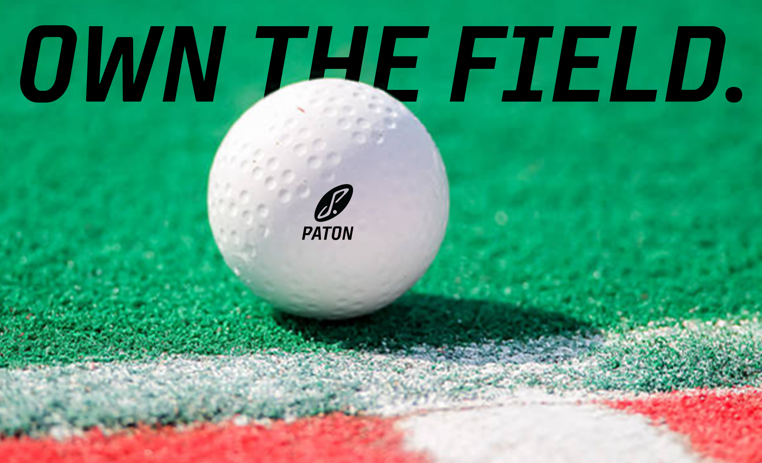
Paton Sport Field Hockey
Athletics
Advertising// Brand & Identity// Logo Design// Art Direction
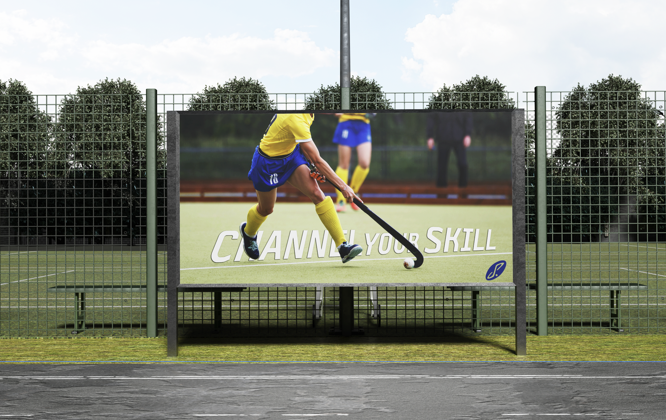
Paton Sport Field Hockey is a brand designed to inspire and empower female athletes. I created this brand based on my person field hockey career, and the support I felt amongst my teammates and coaches. The comradery of my past field hockey teams inspired me to design a brand that lifts women and all field hockey players. Paton’s brand is designed to be uplifting but also have the drive to leave it all on the field.
Tools & Skills: Adobe Photoshop & Adobe Illustrator


The Logo
The inspiration for the logo came from a past coach of mine’s initials, J & P. Combining the two letters pays tribute to the role model she is, as well as maintaining an appearance of a field hockey stick. To demonstrate the slick and fast-paced movement of a field hockey game I altered the orientation. Incorporating the rounded edges in the logo to demonstrate the fluidity and motion of carrying the ball down the field.
Paton Sport Field Hockey, is about the game and I designed a logo to showcase that. At it’s core, Paton, is not only about the game, but the people who make it what it is.
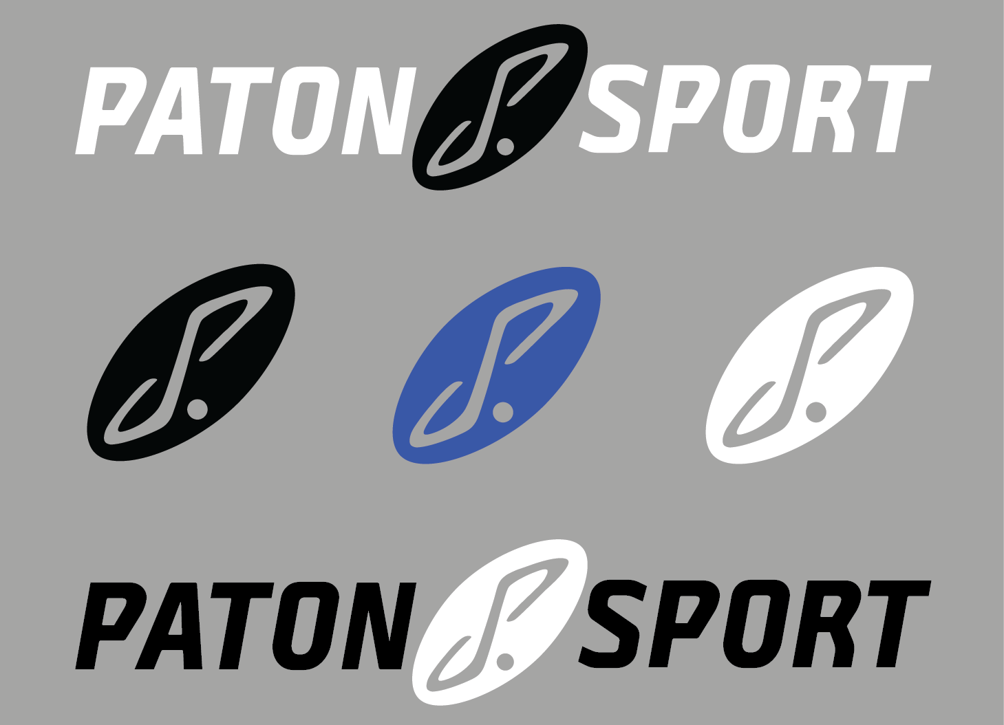
Logo Variations